Stairs, Leicester Square
Applied Studio have recently completed a flagship restaurant in Leicester Square. The fitout was of a new shell (completed by the landlord) with restaurant space from basement to 2nd floor (approx 450sqm) and an office for the operator over the 3rd and 4th floors (approx 190 sqm). One of the major elements of the project was the addition of a front-of-house stair & lift shaft, spanning a total of 6 storeys. The resulting structure created a massive 18 metre-high open space, filling the dining areas and circulation spaces with as much natural light as possible.
This process of uncovering existing finishes can, however, lead to unexpected discoveries and iterations in the design. When exposing the brickwork at Richmond, existing structural steel and services were uncovered around some of the openings. This led to variations within the design, concealing the pipes and steels by boxing in the whole reveal and creating a subtle contrast between the sharp edges of the new addition and rougher exposed brickwork of the old.
The stair of any multiple-floor restaurant has a hugely important role to play, and their design is intrinsic to the success of that restaurant. The stair becomes a feature in its own right, and the journey up or down the stairs offers its own experience that is sufficient to overcome the notional barrier of moving away from the premium space on the ground floor. This stair was no different - it was to be one of the main features of the restaurant.
The existing site's extremely narrow floor plan was the primary challenge in designing the vertical circulation through the restaurant - how could we successfully reconfigure, and connect all dining floors together? The shell was initially developed without an occupier, and came with an existing stair that was unfit for purpose, occupying 80% of the building's width towards the rear of the site, and significantly reducing the highly valuable front-of-house space. These were issues that would have deemed the site unviable due to the loss of highly valuable front-of-house space.
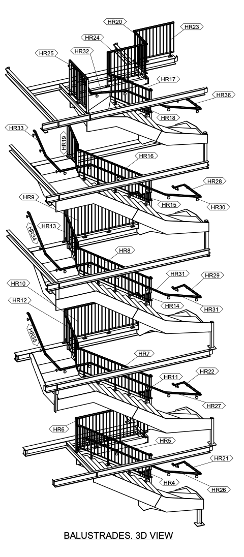
The existing shell stair had to be completely removed, and new voids formed through the shell, with the existing voids filled in. This was a relatively complex engineering challenge over and above those typical of a restaurant fit-out. A "U" shape stair design was developed that would allow for a void to run the full height of the building creating a dramatic, almost "quadruple" height space. The steel and engineering design was a project in its own right - as was its coordination by ourselves into the overall design.
The nature of commercial projects meant that there was no scope, both in terms of time and cost, for a party wall award process. This meant that the structure had to be designed in such a way to avoid any impact on the party walls and for it to be completely self-supporting. This added complexity not just to the design but to the installation process and formation of the void itself.
This was a great project to be a part of, but one of the conclusions from this has to be the recognition of the multiple benefits in having an occupier/tenant on board as early as possible. Had we been on board prior to the shell works then the initial shell stair could have been designed to suit the site’s eventual end use, and we could have avoided the huge expense of what amounted to almost an infrastructure project within the footprint of a restaurant.
This was originally posted on LinkedIn.
View the project in our portfolio here.


